Defining LUJO’s Brand Positioning
LUJO Strategy
Creative Director / Strategy
LUJO began as a self initiated consulting brand focused on helping luxury heritage houses evolve without becoming generic. I created the brand positioning, strategic point of view, and visual system, building the foundation around the idea of heritage and future.
From there, I translated that strategy into a complete brand system. The work included identity, visual codes, and a flexible content structure designed to make LUJO’s thinking feel as refined, intentional, and considered as the brands it aims to guide.
Scope:
Brand positioning, verbal direction, logo system, emblem development, typography, color palette, social templates, and data visualization systems.
Team:
Joel De La Rosa · Nabila Brache · Severo Studio
Excerpt from Brand Guidelines
Strategy
The starting point was the brand promise itself: helping heritage brands stay culturally relevant without losing what makes them distinct. From there, I built the strategy around the relationship between heritage and future. I wanted the brand to feel timeless and current at once, with a sense of restraint, clarity, and cultural awareness. That thinking shaped both the positioning and the overall visual direction.
From there, I turned the strategy into a full system. The identity needed to feel credible in the luxury space without feeling overly expressive or decorative. Every decision, from the logo and typography to the color palette, was made to support a brand that feels thoughtful, refined, and suited for high level strategic work.
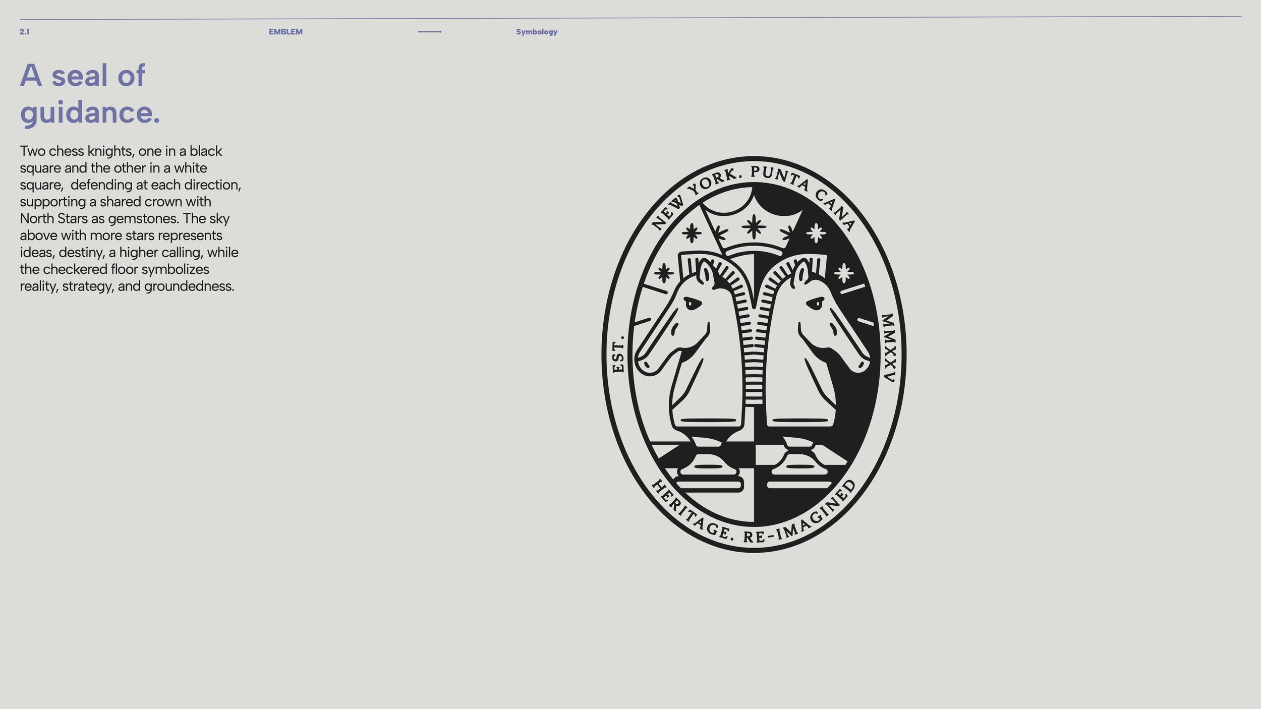
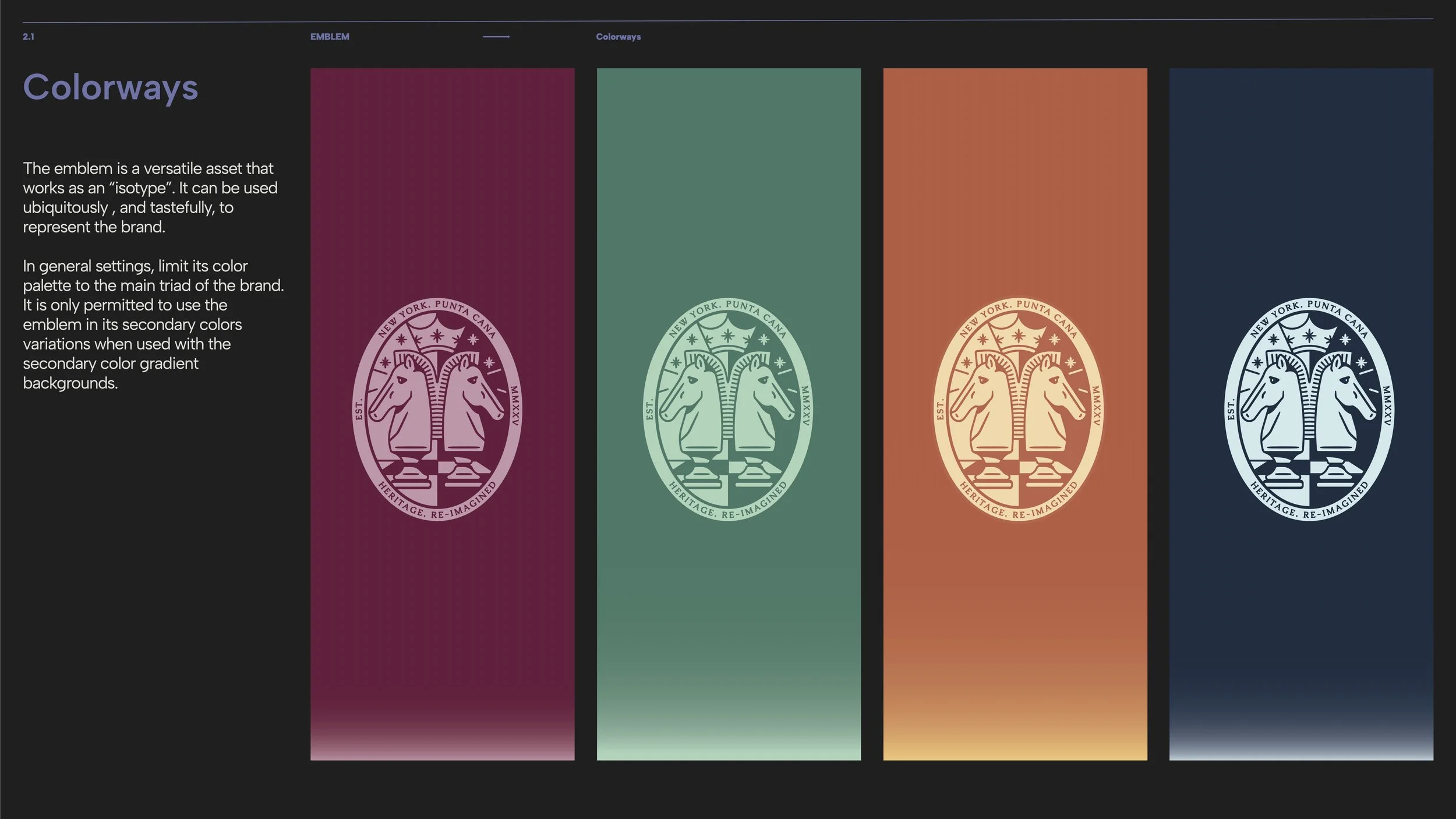
The visual system was designed to express structure, refinement, and guidance. The wordmark draws from the tension between heritage and future, while the emblem introduces a more symbolic layer to the brand. Together, they create a system that can flex across presentations, social content, and digital touchpoints while still feeling consistent and distinct.
Beyond the identity itself, I created a broader communication system for LUJO’s thinking: typography, color logic, social templates, and data visualization frameworks. This made it possible for strategic ideas, benchmarks, cultural indices, customer pathways, and comparative analysis, to feel editorial, brand-aligned, and easy to understand.
Excerpt from Brand Guidelines
The result was a complete brand system for LUJO: one that clarified the consultancy’s positioning, gave it a distinct voice in the luxury space, and created a flexible framework for future content, insights, and client-facing strategy materials.
Printed Case Study